CountBio
Mathematical tools for natural sciences
Biostatistics with R
Drawing inside plots
The graphics library of R has both high level as well as low level graphics facilities.
The functions like plot() , hist(), boxplot() that have learnt belong to the high level graphics in the sense that they each provide a pre-assembled graph, complete with a set of features required for the task. For example, the call to the function hist() renders a histogram of the input data complete with bins, fill colour type, axes informations, outputs etc.
R also provides a set of low level or primitive graphics functions with which the whole graphics can be built in steps. For example, we can draw the X,Y axes, define its properties and then draw points and curves inside the axes step by step.
These primitive functions cannot draw on their own. First a high level function like plot() has to be called and these low level functions can add to the graph created by the plot() function.
These low level functions can be called to add features like line segments, arrows, polygons, axis ticks etc. to enhance the plots created by high level functions. We will learn some of them here.
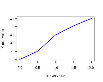
The code block below creates a graph from the scratch using low level functions that are called after creating a canvas using plot() call. The resulting plot and the explanations follow the code.
plot.new()

plot.window(xlim=c(0,2), ylim=c(0,10))

axis(1)

axis(2)

x = c(0.0, 0.5,1.0, 1.5, 2.0)

y =  c(0.0, 2.0, 6.0, 8.2, 10. )

lines(x,y, lwd=2, col="blue")

title(xlab = "X-axis value")

title(ylab = "Y-axis value")

box()
The lines of the above code are explained here:
plot.new() ------- This function creates a new graphics frame, if no graphics window has opened so far. If a graphics window already exists, this advances it to a new plot.plot.window() sets the X and Y ranges for the graph. The range of X and Y axes are set with parameters xlim and ylim The function callsaxis(1) andaxis(2) draw the X and Y axis respectively. The functionlines() draws a line joining the given x and y coordinates. The other parameters of this function like lwd, col etc. are same as described in the inplot() function section. The call to thetitle() adds title to the X and Y axis through parameters xlab and ylab respectively. Other attributes like colour, font etc. of the title can be changed in this function. Finally, the call to the functionbox() draws a box around the graph.
Adding points and lines to a plot
Once a plot has been created by a call to
The points() function draws points at the specified coordinates inside an existing plot. The various attributes of a point like poin type, size, color are set using parameters same as in plot() function.
A given set of points can be joined with lines with
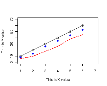
Many calls to points() and lines() after the plot help us to create multiple graphs on the same plot, as we have seen before. The script below adds a set of points and lines to the existing plot.
The above script creates a plot like this:## Adding points and lines to the plot # create pairs of data points x = c(1,2,3,4,5,6) y = c(10,20,30,40,50,60) # Create a normal plot plot(x, y, type="o", xlim=c(1,7), ylim=c(0, 70), xlab="This is X-value", ylab="This is Y-value") # create a new set of data points x1 = c(1,2,3,4,5,6) y1 = c(8, 14, 26, 35, 44, 53) # Adds the above points to the existing plot points(x1, y1, col="blue", pch=18, cex=1.4) # create a new set of new data points x2 = c(1,2,3,4,5,6) y2 = c(6, 10, 18, 26, 38, 45) # Join the above data points with a line lines(x2,y2, lty=2, col="red", lwd=2)
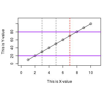
Adding horizontal and vetical lines to a plot
The function
Inside the
abline(v = c(3,5)) ------ draws vertical lines at x=3 and x=5abline(h = c(4,6)) ------ draws vertical lines at y=4 and y=6abline(a=10, b=1) ------ draws vertical lines with intercept 10 and slope 1
## Drawing horizontal and vertical lines across the plot


# Define a data set
x = c(1,2,3,4,5,6,7,8,9,10)
y = c(10,20,30,40,50,60,70,80,90,100)

# create a plot
plot(x, y, type="o", xlim=c(0,11), ylim=c(0, 110),
            xlab="This is X-value", ylab="This is Y-value")

# add title
title(main="Lines across the plot", col="black", font=2)

# draw red colored vertical lines at x values 3,5 and 7
abline(v=c(3,5,7), lty=2, col="red")

# draw purple colored horizontal lines at y values at 20 and 80
abline(h=c(20,80), lwd=2, col="purple")
Drawing line segments inside a plot
We can connect two given points with a line segment using
The function call
If x1,y1,x2 and y2 are single numbers, a line segment is drawn from point (x1,y1) to (x2,y2).
In order to connect a sequence of n points by line segments successively, define x and y vectors of the n coordinate elements. Then the two commands, s = seq[length(n)-1] segments(x[s],y[s],x[s+1],y[s+1]) will connect the successive points with line segments.
In the following code, we first draw a straight line by calling plot() function. We then draw two disconnected line segments followed by a sequence of line segments using calls to segments() function. See the resulting plot below the code:
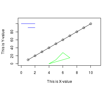
## Drawing disconnected line segments to a plot

# Draw a straight line using a set of (x,y) points
x = c(1,2,3,4,5,6,7,8,9,10)
y = c(10,20,30,40,50,60,70,80,90,100)

plot(x, y, type="o", xlim=c(0,11), ylim=c(0, 110),
      xlab="This is X-value", ylab="This is Y-value", main="Line segments")


# Draw 2 isolated line segments inside the plot.
segments(0,100,2,100, lwd=2, col="blue")

segments(1,90,2,90, lwd=2, col="blue")


# Define a set of n data points
xseg = c(4,5,6,7,4)
yseg = c(0,10,28,15,0)

# define a sequence from 1 to n-1
s = seq(length(xseg)-1)

# connect the sequence of points with line segments successively.
segments(xseg[s],yseg[s], xseg[s+1], yseg[s+1], col="green", lwd=2)
Drawing polygons inside the plot
The
 x, y  ------ The vectors containing the coordinates of the vertices.

 density  ------ An integer specifying the density of shaded line (lines per inch).                         A zero value for density means no shading or filling.

 angle  ------ The slope of the shading lines, in degrees.

 col  ------- The colour for filling the polygon if density is not specified, or density=0.                   If density id specifed, this is the color of the shaded lines.

 border  ------- Specifies the color of the border.

 lty  ------- The lines type to be used, as in plot()
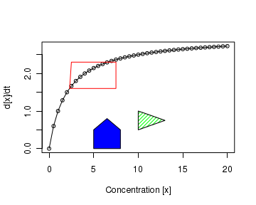
In the script below, we first draw a graph with some points and line through them. A red rectangle is drawn marking the bent portion of the graph. We then add twp polygons, one filled with blue color and other one is a green triangle with line fillings. See the resulting figure below:
## Drawing polygons

## First, draw a graph with points and lines with plot()
x = seq(0,20,0.5)
y = 3*x/(2+x)

plot(x,y,cex=0.7, type="o", xlab="Concentration [x]", ylab="d[x]/dt")


## Draw a polygon defining an area on the graph -- This is a red square
xx = c(2.3,7.5,7.5,2.5)
yy = c(1.6,1.6,2.3,2.3)
# When density=0, col refers to the line colour
polygon(xx,yy, density=0, col="red")


## Draw a polygon filled with blue colour.
xx = c(5,8,8,6.5,5)
yy = c(0,0,0.5,0.8,0.5)
# when density is not mentioned, col refers to filling colour.
polygon(xx,yy,col="blue")


## Draw a polygon filled with lines
xx = c(10,10,13)
yy = c(0.5,1.0,0.75)
## polygon is filled with 20 lines per inch, green in colour.
polygon(xx,yy,density=20, col="green", border="black")
Drawing shaded areas inside the plot
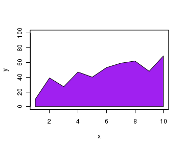
A shaded area of enclised by data points can be created using
##  Shaded area in a graph

## create data vectors.
x = c(1,2,3,4,5,6,7,8,9,10)
y = c(10, 39, 27, 47, 40, 53, 59, 62, 48, 69)

# Drop the end points onto the horizontal axis
xx = c(1, x, 10)
yy = c(0, y, 0)

# plot the points without actually displaying them.
plot(x,y,type="n", ylim=c(0,100))

## create a polygon between data points and X axis and colour it
##   to get a shaded region.
polygon(xx,yy,col="purple")
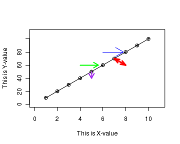
Drawing arrows in a plot
The
x1,y1  ------  coordinates of the point from where arrow starts.

x2,y2  ------  coordinates of the point where arrow starts.

length  ------ length of the edges of arrow head in inches

angle  ------ angle of arrow head from the shaft in degrees

code ------ integer to specify type of arrow

col, ltyl, lwd  ------ colour, line type and line width respectively.
See the example code and the resulting plot given below:
## Drawing arrows in the plot


## define vectors of coordinates
x = c(1,2,3,4,5,6,7,8,9,10)
y = c(10,20,30,40,50,60,70,80,90,100)

# plot the graph
plot(x, y, type="o", xlim=c(0,11), ylim=c(0, 110), pch=10,
      xlab="This is X-value", ylab="This is Y-value", main="Drawing arrows")

## Draw individual arrows
arrows(6,80,7.8,80, col="blue")

arrows(4,60,5.6,60, length = 0.15, angle = 30, lty=1, lwd=2,col="green")

arrows(5,40,5,50, length = 0.15, angle = 30, lty=1,code=1 , lwd=2, col="purple")

arrows(8,60,7,70, length = 0.15, angle = 20, lty=1,code=3 , lwd=3, col="red")

dev.off()