CountBio
Mathematical tools for natural sciences
Biostatistics with R
Pie Charts
Suppose we have a set of numbers representing certain quantities, and we want to represent each number as a fraction of the whole. We use pie chart for this. A pie chart is a circular plot in which the various quantities are represented by circular sections of arc, like dividing an apple pie or a pizza. The arc length and hence the area of each section is proportional to the fraction of that quantity in the whole sum.
The Pie charts in R can be drawn using pie() function of the plot library. This function takes a vector of data values and a vector of color names for the segments as arguments. We can also choose the data segments to be drawn clockwise or anticlockwise. The anticlockwise is the default. See the script below for a simple Pie chart:
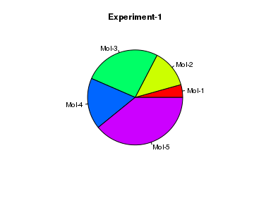
# create data
result = c(10, 30, 60, 40, 90)

# Create a Pie chart with a heading and rainbow colors
pie(x = result, main="Experiment-1", col=rainbow(length(result)),
     label=c("Mol-1","Mol-2","Mol-3", "Mol-4", "Mol-5"))
Important parameters of the pie() function are described here:
x ----- a vector of non-negative numbers as data labels ----- a vector of one or more character strings for labelling. edges ----- number of edges for the polygon that approximates the circle of pie chart. radius ----- the pie circle is drawn inside a square whose sides are -1 to +1. We can use smaller radius if we need some more space around the pie for long character strings. clockwise ----- a logical value indicating whether the slices are drawn clockwise or counter clockwise. Default is counterclockwise. density ----- the density of shading lines, in lines per inch. the default value NULL means no shading line is drawn, and is fully coloured. angle ----- the angle of shading lines, given in degrees, counter-clockwise. Thus, angle=0 is horizontal, angle=90 is vertical lines, angle=40 is line with 40 degree slope. col ----- a vector of strings as color names for shading the sections..
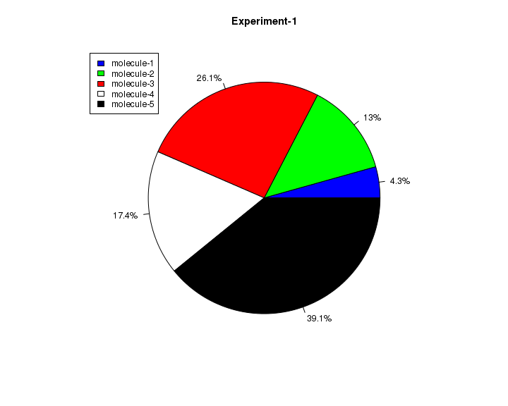
As a second example, we will now create a pie chart with percentage values as labels and add legends to it. See the example below:
# create data
result <- c(10, 30, 60, 40, 90)

# Calculate the percentage of  sections and put it in the label
alabels <- round((result/sum(result)) * 100, 1)
alabels <- paste(alabels, "%", sep="")

colors <- c("blue", "green","red", "white", "black")

pie(result, main="Experiment-1", col=colors, labels=alabels, cex=0.8)

# draw the legend
legend(-1.2, 1.0, c("molecule-1", "molecule-2", "molecule-3",
        "molecule-4", "molecule-5"), fill=colors)