CountBio
Mathematical tools for natural sciences
Basic Statistics with R
ROC Curve
The Receiver Operating Characteristic (ROC) curve is a graphical and quantitative method of representing the ability of a diagnostic technique or any methodology (also called as "model") to perform the the binary classification of a system. For example, for a particular disease, how good is a new diagnostic measurement of a certin chemical in saliva in classifying subjects into "disease present" or "disease absent" categories? Specifically, what is the threshold level of the detected chemical that separates these two categories clearly?
The methodolgy of ROC curve was originally developed by engineers who used radar signals to detect the presence of enemy aricraft during second world war. The word "Receiver" in ROC originally referred to antenna receiver. As the sensitivity of detection ( for true positive signals from aircraft) increased, the noise (false positive signal due to other factors, or specificity) also increased. ROC curve displays the variation of true positives against false positives as the threshold value of detection changes.
The idea behind the ROC Curve
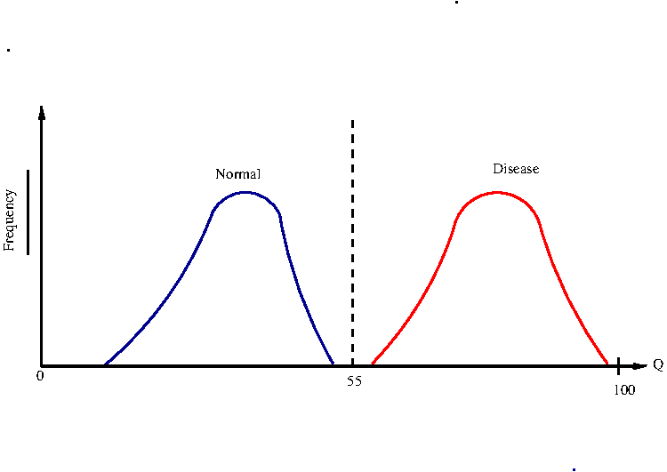
Consider a diagnostic procedure for identifying the presence of a disease. Let the diagnostic measurement Q have value between 0 - 100 on a continuous scale, where 0 represents complete absence of disease and 100 the total presence.
A clinical trial was performed on certain number of subjects, a fraction of whom have the disease and the remaining fraction or healthy. For each subject, the presence or absence of the disease has been confirmed by some other powerful method. Thus knowing whether a disease is present or not in a person, we apply the diagnostic procedure and get a number between 0 to 100. For all the subjects, we plot the histogram or prbability density distribution of the diagnostic values Q.
We consider two cases.
First we
consider the ideal case in which the distributions of Q for the normal and disease persons are clearly separated. See Figure-1 below.
In this case, we can choose a Q value (eg, Q=55) as a theshold value that separates the two binary categories of normal and disease states. This rarely happens in real life.
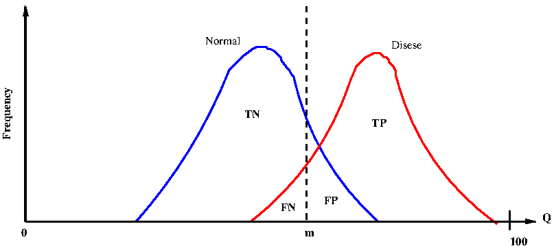
Next, consider the real situation where there is a overlap between the probability densities of Q for the normal and disease cases. See Figure-2 below:
In Figure-2 bove, let us take an arbitrary value Q = m to be the threshold for separating the disease and normal cases.
Any subject with measured value \(\small{Q \lt m}\) is diagnosed to be normal and those with value \(\small{Q \gt m}\) is diagnosed to have the disease.
Since the two distributions overlap, there are 4 distinct regions in the curve as follows:
1. The area to the left of m under the normal curve corresponds to true negatives (TN). They are diagnosed to be healthy when they are actually healthy.
2. The area to the right of m under the normal curve corresponds to false positives (FP). They are diagnosed to have the disease, while they are actually healthy.
3. The area to the left of m under the disease curve corresponds to false negatives (FN) . They are diagnosed to be healthy while they actually have the disease.
4. The area to the right of m under the disease curve corresponds to true positives (TP) . They are diagnosed to have the disease while they actually have.
Since we know which subject actually has the disease or healthy (by independent means), we can estimate the above four quantities with the results of test procdure and actual results to fill the following 2x2 contingency table(disease actually Present or Absent(healthy), diagnosys Positive or Negative) for every aubject:
| Present | Absent | Sum | |
|---|---|---|---|
| Positive | TP | FP | TP+FP |
| Negative | FN | TN | FN+TN |
| Sum | TP+FN | FP+TN | n=TP+TN+FP+FN |
| Subject # | Q-parameter(from test) | Category (prior knowledge) |
|---|---|---|
| 1 | $~~~~~~~~~~~~$98 | $~~~~~~~~~~~~$Present |
| 2 | $~~~~~~~~~~~~$69 | $~~~~~~~~~~~~$Present |
| 3 | $~~~~~~~~~~~~$23 | $~~~~~~~~~~~~$Absent |
| 4 | $~~~~~~~~~~~~$19 | $~~~~~~~~~~~~$Absent |
| 5 | $~~~~~~~~~~~~$23 | $~~~~~~~~~~~~$Present |
| 6 | $~~~~~~~~~~~~$51 | $~~~~~~~~~~~~$Absent |
| ... | ............... | ............... |
| ... | ..... | ..... |
| 249 | $~~~~~~~~~~~~$70 | $~~~~~~~~~~~~$Absent |
| 250 | $~~~~~~~~~~~~$56 | $~~~~~~~~~~~~$Present |
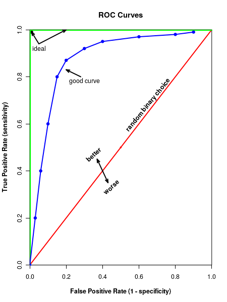
Important Question : How do we quantify the curve above the red line for the strength of classifier?.
Area under the ROC curve
The ROC curve is a graph of true positives against the false positives at various threshold vales of the classifier considered. In Figure-2 above, we see that if the classifier is effectless, it randomly classifies the sample point into disese or healthy with eqal probability, like a coin toss. In this case, we get a 45 degree line. Since bothe the axes span value between 0 to 1, area under this diagonal red line is 0.5.
On the other extreme, if the classifier works perfectly, we get the green line that goes along the vertical and then horizintal axes. The curve has an area of 1, the area of the rectangle, with each side 1 unit of length.
If the ROC curveis above the red diagonal, it is better than a coin toss. The better area thus lies between 0.5 to 1.0. The area under the ROC curve represnts the discrimination, which is the ability of the classifier to distinguish between those with the disease from healthy people. The area is generally estimated with special numerical methods. Generally, the discrimination or area under the aurve (AUC) for th ROC plot is classified into 5 cases, purely based on the value of area under the curve: \(\small{~~~~~~0.9~-~1.0~~~~~~~~Excellent~(A) }\) \(\small{~~~~~~0.8~-~0.9~~~~~~~~Good~(B) }\) \(\small{~~~~~~0.7~-~0.8~~~~~~~~Fair~(C) }\) \(\small{~~~~~~0.6~-~0.7~~~~~~~~Poor~(D) }\) \(\small{~~~~~~0.5~-~0.6~~~~~~~~Fail~(F) }\) In the next section, we will learn to plot ROC curve in R and estimate te parameters like Area Under The curve,which will help us to interpret the data.
R scripts
Description of the data set for the R script
For demostrating the ROC analysis in R, we will use the Wine Quality data set from UCI Mchine learning repository. This data can be downloded from here.
The modeling work with results was originally published by P. Cortez et.al. The reference is given below:$~~~~~~~~~~~$ P. Cortez, A. Cerdeira, F. Almeida, T. Matos and J. Reis. $~~~~~~~~~~~~$Modeling wine preferences by data mining from physicochemical properties. $~~~~~~~~~~~~~$ Decision Support Systems, Elsevier, 47(4):547-553, 2009. In this site, two datasets are included, related to red and white vinho verde wine samples, from the north of Portugal. The goal is to model wine quality based on physicochemical tests. There are 11 input varibles: fixed acidity, volatile acidity, citric acid, residual sugar, chlorides, free sulfur dioxides, total sulfur dioxide, density, pH, sulphates and alcohol level. The output variable is the quality score in scale of 0 to 10 from wine tasting (sensory data). There are 4898 samples for which 11 variables are listed along with the sensory scores. If the score is greater than or equal to 6, the wine is classified as "good" and if it is less than 6, it is clssified as "bad". We have included this classificaion term to the last column of one of the white wine data sets in UCI machine learning repository and will use this data in the R script below. This data, identical to original data except for an extra column (called wine quality, either "goood" or "bad0 in the end is stored in a file white_wine_data.csv and can be downloaded.
##############  R script for computing and plotting ROC curve  #######################


## include pROC library
library(pROC)


## Read the data file in csv format into frame clled "data"
data = read.csv("white_wine_data.csv" ,header=TRUE)

## We will now see the effectiveness of "alcohol" content data in clssifying the "wine_quality" into
##   "good" and "bad" by drawing ROC curve between these two quantities.

## call "plot.roc()" function to plot the curve

rocobj <- plot.roc(data$wine_quality, data$alcohol,             # data vectors
                   main = "ROC curve for wine classification",  # main title
		   legacy.axes=TRUE,                      # TRUE will plot sensitivity against 1-specificity
		                                          # FALSE plots sensitivity aginst specificity
                   percent=TRUE,                          # TRUE plots in percentages, FLASE for fractions
		   col="red",                             # color of curve
		   type="l",                              # "l" for line
                   ci = TRUE,                             # if "TRUE", plot Confidence interval of AUC
                   print.auc = TRUE,                      # print values of AUC
		   identity.lwd=2,                        # line width of identity line(45 deg line)
		   identity.col="purple",                 # color of identity line
		   print.thres=TRUE,                      # if "TRUE", print best threshold value on graph
		   print.thres.col="red",                 # color of threshold value
		   print.thres.cex=0.8,                   # font size of threshold value
		   print.auc.col="red",                   # color of AUC curve
		   print.auc.cex=0.8                      # font size of AUC curve

		   )


## Compute confidence intervals of Sensitivities at vrious specificities.
##  (similarly, ci.sp() computes confidence intervals of specificities for various sensitivities
##  Useses bootstrap method.

ciobj <- ci.se(rocobj,                         # CI of sensitivity
               specificities = seq(0, 100, 5),  # CI of sensitivity at at what specificities? 0,5,10,15,....,100
	       conf.level=0.95,                 # level of Confidence interval
	       )


## Add the Confidence interval plot to the already existing plot
plot(ciobj, type = "shape", col = "cyan")     # plot as a blue shape

## Add the best threshold value to the plot
plot(ci(rocobj, of = "thresholds", thresholds = "best")) # add one threshold "shape", col = "#1c61b6AA")

## print the confidence intervals of sensitivity at vaarious specificities
print(ciobj)
Executing the above script in R prints the following results and figures of probability distribution on the screen:
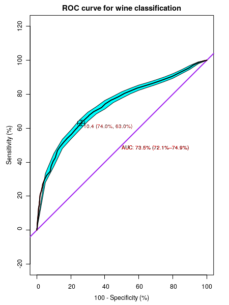
95% CI (2000 stratified bootstrap replicates):
  sp   se.low se.median se.high
   0 100.0000  100.0000  100.00
   5  97.9800   98.5600   99.06
  10  94.6500   95.8100   96.92
  15  92.0300   93.2400   94.37
  20  89.3900   90.7700   92.10
  25  87.4600   88.8300   90.15
  30  85.6600   87.0600   88.44
  35  84.0200   85.4500   86.85
  40  82.3400   83.9200   85.40
  45  80.2300   81.9600   83.50
  50  77.6700   79.6600   81.49
  55  75.0900   77.1100   78.86
  60  71.3000   74.0300   76.33
  65  68.4400   70.5900   72.68
  70  64.1200   66.8300   69.42
  75  58.8200   61.8000   64.73
  80  53.5500   56.1100   58.86
  85  48.0200   50.7500   53.43
  90  37.5500   41.1900   45.06
  95  28.0300   30.6900   33.25
 100   0.3683    0.6446    1.32