CountBio
Mathematical tools for natural sciences
Biostatistics with R
Plotting a mathematical function
Given an expression for a function y(x), we can plot the values of y for various values of x in a given range. This can be accomplished using an R library function called
Plotting a simple function directly
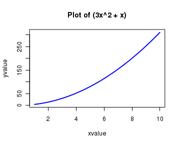
We now plot s simple function $ y = 3x^2 + x $ in the range $x = [1,10]$ as follows:
curve(  3*x^2 + x, from=1, to=10, n=300, xlab="xvalue", ylab="yvalue",
             col="blue", lwd=2, main="Plot of (3x^2 + x)"  )
The above command gives the following plot:
The important parameters of the functioncurve() used in this call are as follows: An mathematical expression as a first parameter. The expression is written using the format for writing mathematical operations in R Two number parameters called from and to that represent the first and the last points of the range of independent parameter x. n is an integer that represents the number of points (values of x) equally spaced between from and to values. The values of the function are computed at these n points. The other parameters like xlab, ylab, col, lwd, main have their usual meaning as in theplot() function.
To plot an equation
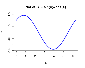
An equation defined outside the
eqn = function(x){sin(x)+cos(x)}

curve(eqn, from=0, to=2*pi, n=200, xlab="Y", ylab="X", col="blue",lwd=2,
             main="Plot of  Y = sin(X)+cos(X) ")
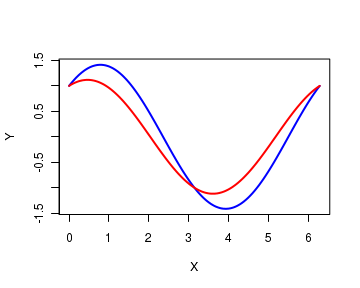
Adding a new plot to the existing plot
More than one function can be plotted in the same graph by using a parameter add, which takes boolean values TRUE or FALSE. When add=TRUE, the current curve will be added to the existing curve.
In the following script, we define two equations and plot them on the same plot. The first formula is plotted as before, and the second one is plotted using the parameter value add=TRUE in the function call:
equation1 = function(x){sin(x)+cos(x)}

curve(equation1, from=0, to=2*pi, n=300, xlab="X", ylab="Y", col="blue",lwd=2,
             main="Plot of  Y = sin(X)+cos(X) ")

equation2 = function(x){0.5*sin(x)+cos(x)}

curve(equation2, from=0, to=2*pi, n=300, add=TRUE, xlab="X", ylab="Y", col="red",lwd=2,
             main="Plot of  Y = sin(X)+cos(X) ")
Curve with logarithmic scale
Similar to the plot() function, the parameter log sets the logarithmic scale (natural logarithm). log="xy" sets both the axes to log scale. Similarly, log="x" and log="y" set the X and Y axis respectively to the log scale. See the example below where we plot a function $y = x^2$ in the range [1,100] in logarithmic scale for both the axes.
curve( x^2, from=1, to=1000, log = "xy", col="blue", lwd=2 )