CountBio
Mathematical tools for natural sciences
Biostatistics with R
The plot() function -- plotting points and lines
The graphics package has a generic function called plot() which is very versatile, and can be used to create diferent types of (X,Y) plots with points and lines. We will lean about it in this section
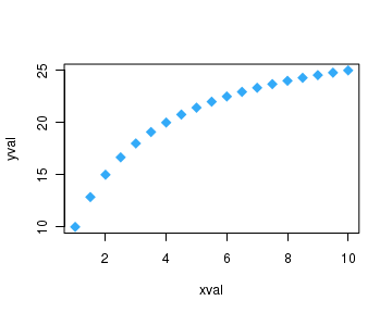
The default plot
Point and line plots can be produced using
In the command lines below, we first create a pair of sequences x and y and pass them as parameters to the
xval = seq(1,10,0.5)
yval = 30*xval/(2+xval)
plot(xval,yval)
Execution of above code lines creates the following figure on the screen:

In the above plot, we notice that the names of the variables 'xval' and 'yval' are displayed as axes titles. Many specifications like properties of plot symbol, colors, axes ranges etc. are given their default values in the absence of any specification in the plot() function call. In fact, the minimum requirement for a plot() call are the values of (x,y) coordinates.
We will learn to change most of the plot parameters.
Data point attributes
The data point has three properties that can be varied : symbol, size, colour. These properties can be set by providing values to corresponding parameters in the plot() function:
The parameter that sets the symbol is called
      pch --->  takes values between 0 to 24 to give 25 symbols.

                In addiditon, 10 keyboard characters like "*", "+", "o","@","#" etc can be used.
The list of 25 symbols are given below:

      pch=0    square
      pch=1    circle
      pch=2    triangle point up
      pch=3    plus
      pch=4    cross
      pch=5    diamond
      pch=6    triangle point down
      pch=7    square cross
      pch=8    star
      pch=9    diamond plus
      pch=10   circle plus
      pch=11   triangles up and down
      pch=12   square plus
      pch=13   circle cross
      pch=14   square and triangle down
      pch=15   filled square blue
      pch=16   filled circle blue
      pch=17   filled triangle point up blue
      pch=18   filled diamond blue
      pch=19   solid circle blue
      pch=20   bullet (smaller circle)
      pch=21   filled circle red
      pch=22   filled square red
      pch=23   filled diamond red
      pch=24   filled triangle point up red
      pch=25   filled triangle point down red
The parameter for changing the size of the data point is
      cex --->  A number indicating the amount by which plotting text and symbol
                should be scaled relative to the default value.

                Thus, cex = 1     is default size
                      cex = 1.5   is 150% of default size
                      cex = 0.5   is 50% of default size

                [Note :  cex.axis  --> scales the axis
                         cex.lab   ---> scales the label
                         cex.main --> scales main title
                         cex.sub  ---> scales the subtitle ]
The colour of the data points can be set using a parameter called
The colour parameter can be set in two ways. We can give the name of color value as a string which is defined in R. Thus, col = "blue -----------> sets the symbol to blue colour col = "red" -----------> sets the symbol to red colour etc. In R prompt, the command> colors() returns names of 657 colours that can bes used for this parameter.
Another way of setting the colour is to provide valus for col parameter in hexadecimal representation. For example,
   col = "#A9F3BB"   ------>  colour corresponding to  Red=A9, Green=F3, Blue=BB in
                               hexadecimal representation.

   col = "#FF0000"   -------> colour corresponding to  Red=FF, Green=00, Blue=00 in
                              hexadecimal epresentation.
                              ( This is maximum strong red colour, since
                                 Blue is 00, and green is 00. ).
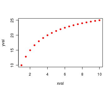
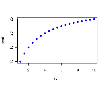
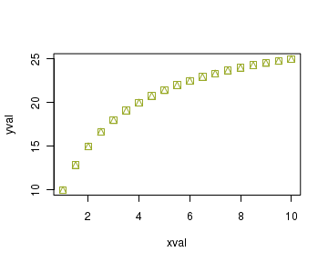
Using the above mentioned properties, the following code lines plot data points with
xval = seq(1,10,0.5)
yval = 30*xval/(2+xval)
plot(xval, yval, pch=20, cex=1, col="red" )
The four figures below show plots corresponding to four different sets of these three parameters:
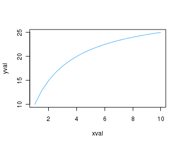
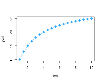
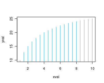
Joining points with lines and their attributes
In the plot() function, the data points can be joined with lines in different ways to create various types of plots. We use the
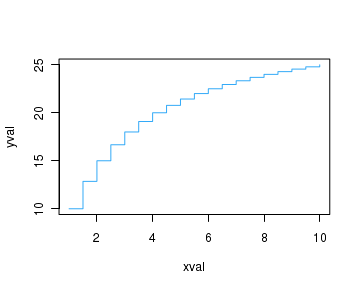
       type="p"  plots points
       type="l"  plots lines
       type="b"  plots points and lines
       type="o"  plots points overlaid by lines
       type="h"  plot with histogram like vertical lines
       type="h"  plot with histogram like vertical lines
       type="s"  plot with stair steps
       type="n"  no plotting - blank plot with axis marked (x,y)
The script lines below plots both the points and lines:
xval = seq(1,10,0.5)
yval = 30*xval/(2+xval)
plot(xval, yval, pch=20, cex=1, col="red", type="b")
The plots corresponding to the above types are presented below:


The line types can be specified in the
     lty = 0     or    lty = "blank"

     lty = 1     or    lty = "solid"

     lty = 2     or    lty = "dashed"

     lty = 3     or    lty = "dotted"

     lty = 4     or    lty = "dotdash"

     lty = 5     or    lty = "longdash"

     lty = 6     or    lty = "twodash"
The line width can be specified using the parameter
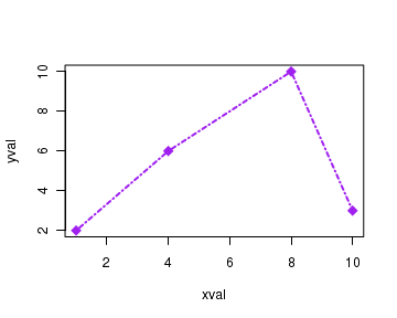
For example, the code lines below create a solid line joining the given points with the normal thickness:
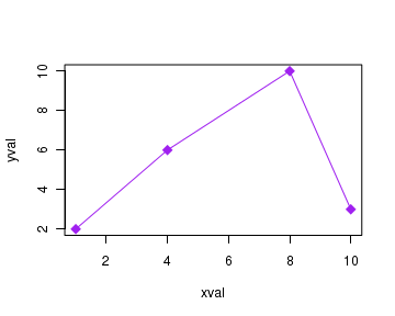
xval = c(1,4,8,10)
yval = c(2,6,10,3)
plot(xval, yval, pch=20, cex=1, col="red", type="b", lty=1, lwd=1)
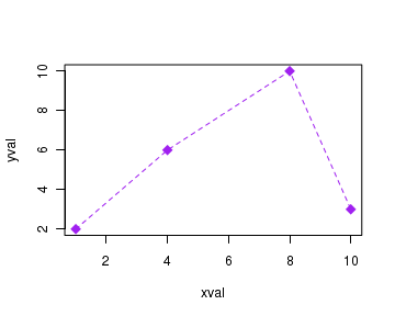
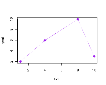
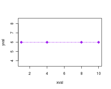
The plots for various values of line type and width are reproduced here:

Adding main title to the plot
Now we will add a main title to the plot with its own font type, font colour and font size.
To add a title, we set the value of the parameter called
       col.main  --->  sets the color of main title
                       Takes same values as 'col'

       font.main --->  sets the font of main title.
                       font.main = 1  for plain
                       font.main = 2  for bold
                       font.main = 3  for italic
                       font.main = 4  for bold italic

       cex.main --->   scales the main title, as explained before.
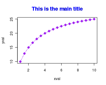
The code segment below creates a plot with main title having some font properties mentioned above.
xval = seq(1,10,0.5)
yval = 30*xval/(2+xval)
plot(xval, yval, pch=18, cex=1.8, col="purple", type="o", lty=6, lwd=1,
         main="This is the main title", col.main="blue", font.main=2, cex.main=1.5 )
The above code creates the following plot with main title:
Axes titles and their properties
We can add axes titles with chosen color, size and font. The titles to the X and Y axis can be given with parameters
xval = seq(1,10,0.5)
yval = 30*xval/(2+xval)
plot(xval, yval, pch=18, cex=1.8, col="purple", type="o", lty=6, lwd=1,
     main="This is the main title", col.main="blue", font.main=1, cex.main=1.5,
     xlab = "Concentration (mmol/L)", ylab = "Velocity (mmol/L/sec)",
     font.lab = 2, col.lab="brown", cex.lab = 1.2)

Setting the ranges of the X,Y axes
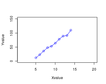
When plot function is called with data, it computes the ranges of X and Y axis based on the minimum and maximum values of the variables in the data set. Sometimes, we may require to fix the range of the data by hand, rather than by the data values. The ranges of X and Y axis can be varied using the parameters xlim and ylim. (xlim, ylim stands for 'x limit" and 'y limit' respectively).
The parameters
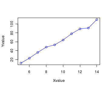
See the 2 plot calls below. In the first plot call, ranges are selected by default based on the data values. In the second plot call, the x axis is set in the range 1 to 20 and y axis is set in the range 1 to 150 using the code lines and the corresponding plots are shown below:
 Xvalue = c(5,6,7,8,9,10,11,12,13,14)
 Yvalue = c(12, 23, 36, 48, 53, 64, 78, 89, 91, 110)

 # No range selection. Default range from data
  plot(Xvalue, Yvalue, col="blue", type="o")

 # Range is set using xlim and ylim parameters
  plot(Xvalue, Yvalue, col="blue", type="o", xlim=c(1,20), ylim=c(1,150))
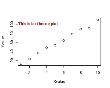
Writing text inside a plot
We can write text inside the plot for explanation and labelling curves using
The text() call can be given inside plot() function as well as after the call to the plot(). See the script below:
 Xvalue = c(1,2,3,4,5,6,7,8,9,10)
 Yvalue = c(12, 23, 36, 48, 53, 64, 78, 89, 91, 110)

 # We add text whose center is at a particular location (3, 105) in the plot.
 # First look at the plot, and decide the units for (x,y)!!
   plot(Xvalue, Yvalue, text(3,100,"This is text inside plot", col="brown", font=2))
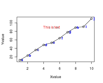
We can also label each individual data point with a character text . For this, create a vector of characters that label each data point and pass this vector to the text() function. The X,Y positions of these data labels will be same as that of data points with some X or Y offset added to prevent them from overlapping the data points. In the example below, we have added text to each point as well as a common text separately:
 Xvalue = c(1,2,3,4,5,6,7,8,9,10)
 Yvalue = c(12, 23, 36, 48, 53, 64, 78, 89, 91, 110)

 # these letters are labels for data points.
 cch = c("a","b","c","d","e","f","g","h","i","j")

 # plotting the graph
 plot(Xvalue,Yvalue, type="o")

 # adding text label to each point
 text(Xvalue+0.3, Yvalue, cch, col="blue", font=2)

 # adding a second text string inside the plot.
 text(5,90, "This is text", col="red")
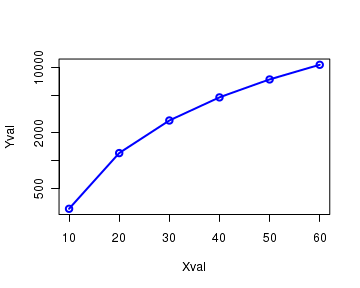
Logarithmic Scale for the axes
One or both the axes of the plot can be drawn on logarithmic scale using the parameter
Xval = c(10,20,30,40,50,60)
Yval = 3*Xval^2
plot(Xval, Yval, log="y", type="o", col="blue", lwd=2)